Creative Process
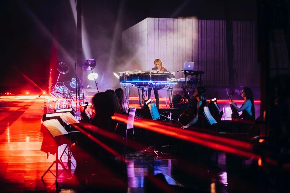
The 5th annual Ohana Festival returned to Doheny State Park at Dana Point, California after a two-year hiatus due to the coronavirus. The annual three-day beach festival was curated by Pearl Jam frontman Eddie Vedder, and Pearl Jam manager Mark Smith in partnership with Live Nation.
Gear
Canon 7dmii
Canon 70-200mm f2.8ii
Canon 6dmii
Canon 17-40 f4
Canon 1.4x extension
Software
Adobe Lightroom Adobe Indesign Adobe Photoshop Adobe IllustratorCategories
Book Layout Mockup Branding Typography / Font PhotographyOther tools
Wacom Intuos Pro Issuu.com flip book San Disk Extreme CF cards
This is an exploration of the Festival from the eyes of a photographer and graphic designer, exploring festival design including font, artwork, and branding.
This book and website are for educational purposes only in connection with a graphic design degree narrative assessment project.
Time Management
The point of using Lorem Ipsum is that it has a more or less normal distribution of the point of using.User Testing
The point of using Lorem Ipsum is that it has a more or less normal distribution of the point of using.Market Research
The point of using Lorem Ipsum is that it has a more or less normal distribution of the point of using.Team Management
The point of using Lorem Ipsum is that it has a more or less normal distribution of the point of using.


COlor Palette
Hex # 026970 RGB (2,105,112)
Hex # fca726 RGB (253,186,76)
Ohana Festival Logo Assessment
To Review the font Style Let’s first look at its anatomy, properties, and classification.
The Ohana Festival Typography Style uses a clean modern geometric font with a few tweaks to certain properties. At first glance, it is a Sans Serif font. Sans Serif has a clean modern distinct sharp tip to the font legs, arms, and Apex. The font is heavily weighted – thick hefty bold letters. The width of each letter is consistent throughout. The “O” is rounded and not an oval shape equal across the axis. The “A” and “H” have slightly lower crossbars. The “A” and “N” have a pointed tip on their apex. Similar font style with these characteristics is JOSEFIN SANS, Helvetica, and Futura.
My exploration of the logo using the font typeface: Gill Sans MT.
During this exploration, I found other tweaks to the typeface in regards to tracking and kerning.
My Gill Sans version of the logo is drawn to the left. It is also the font style I used through out the booklet with Tracking and Kerning closely resembles that of the original Ohana Festival logo. I also used a complementary adobe font: Segoe Script in the project.

JOSEFIN SANS

GILL SANS

Check out the full book here:
Mobile Slideshow app here: https://adobe.ly/3n0r1VJ